Introduction
On Tuesday, I launched the alpha version of the wnblr package, yahoooo!! (Guess I better write a blog post about that sometime.) wnblr currently contains live stats recorded from WNBL games played from 2014 to 2020, inclusive. You can find it here: https://github.com/jacquietran/wnblr
Over on Twitter, I flagged down Paul Flynn (Assistant Coach, Melbourne Boomers WNBL) to take a look-see, and he asked for some specific advanced stats that can be derived from the standard game stats that are typically recorded (e.g., box score stats like points scored, number of rebounds, and so on):
Would be keen to view any data on points per possession, pace and correlating eFG% over the same period.
— Paul Flynn (@paulflynn611) December 1, 2021
First cab off the rank: points per possession.
(Don’t worry, coach: I’ll get to the other metrics in due course!)
Getting started
Load R libraries
Load up the libraries we need. The wnblr package currently includes 4 built-in data sets with various game statistics. For this analysis, we’re going to use the box_scores data which is recorded at the team-level.
# Install the development version of {wnblr} from Github
# remotes::install_github("jacquietran/wnblr")

# Load libraries
library(wnblr)      # for retrieving WNBL game stats
library(dplyr)      # for tidying data
library(tidyr)      # for tidying data
library(gt)         # for making data tables
library(showtext)   # for loading custom fonts for plots
library(ggplot2)    # for plotting
library(ggbeeswarm) # for plotting
library(ggtext)     # for formatting text in ggplot2 objects
Tidying data
The points per possession metric is what it says on the tin: the number of points that a team scores per possession. Higher values are better. Values over 1 mean that a team has managed to score at least 1 point for each possession, which would come about from giving up fewer turnovers and having fewer missed shots that are rebounded by the opposition.
Per NBAStuffer.com, points per possession is calculated as follows:
Points per possession = PTS / (FGA + (0.44 * FTA) + TO)
(Where: PTS = Total points scored; FGA = Field goals attempted; FTA = Free throws attempted; TO = Turnovers)
Taking a closer look at the 2020 season
With the 2021 WNBL season kicking off this weekend, it might be worth looking at how teams performed on the points_per_possession metric in the 2020 regular season.
# Subset to games in the 2020 season -------------------------------------------

points_per_possession %>%
  filter(season == 2020) %>%
  # Exclude finals games
  filter(!page_id %in% c(
    "1809808", "1809807", "1809809", "1809810")
    ) -> ppp_2020

# Calculate summary stats ------------------------------------------------------

ppp_2020 %>%
  group_by(team_name) %>%
  summarise(
    points_per_possession_mean = round(
      mean(points_per_possession), 3),
    points_per_possession_sd = round(
      sd(points_per_possession), 3),
    points_per_possession_sd_lower = points_per_possession_mean -
      points_per_possession_sd,
    points_per_possession_sd_higher = points_per_possession_mean +
      points_per_possession_sd) %>%
  ungroup() -> ppp_2020_summarised
We can get a sense of which teams typically had high or low scoring efficiency by looking at whole-season summary stats. The table below shows each team’s mean (i.e., averages) and standard deviation (SD) for points per possession.
# Present summary stats in a table ---------------------------------------------

ppp_2020_summarised %>%
  select(team_name, points_per_possession_mean, points_per_possession_sd) %>%
  arrange(desc(points_per_possession_mean)) %>%
  # Rename columns for human readability
  rename(
    Team = team_name,
    Mean = points_per_possession_mean,
    SD = points_per_possession_sd) %>%
  gt() %>%
  data_color(
    columns = "Mean",
    colors = scales::col_numeric(
      palette = c("#ffeec2", "#ee6f00"),
      domain = c(min(Mean), max(Mean)))) %>%
  data_color(
    columns = "SD",
    colors = scales::col_numeric(
      palette = c("#b6d8ff", "#3090ff"),
      domain = c(min(SD), max(SD)))) %>%
  tab_spanner(
    label = "Points per possession",
    columns = c(Mean, SD)) %>%
  tab_source_note(
    source_note = md(
      "**Data source:** {wnblr} R package and WNBL.com.au | **Table:** @jacquietran")
    ) %>%
  tab_options(
table.width = pct(70))| Team | Points per possession | |
|---|---|---|
| Mean | SD | |
| Southside Flyers | 1.057 | 0.117 |
| Townsville Fire | 0.935 | 0.118 |
| Melbourne Boomers | 0.866 | 0.120 |
| UC Capitals | 0.865 | 0.117 |
| Adelaide Lightning | 0.794 | 0.114 |
| Perth Lynx | 0.793 | 0.142 |
| Sydney Uni Flames | 0.760 | 0.120 |
| Bendigo Spirit | 0.716 | 0.123 |
| Data source: {wnblr} R package and WNBL.com.au | Table: @jacquietran | ||
In the 2020 regular season, the Southside Flyers were far and away the most efficient scoring team, in terms of converting possessions to points. They were the only team to average over 1 point per possession across the season (although Townsville got close).
Points per possession at the per-game level
Summary stats are useful, but their very nature is blunt: condensing team performance across multiple games into a singular numbers. So…why not have both?
# Merge per-game stats with summary stats
left_join(ppp_2020, ppp_2020_summarised,
          by = "team_name") %>%
  # Create a column for labelling means
  mutate(
    ppp_mean_label = format(
      points_per_possession_mean, nsmall = 3)) %>%
  # Set order of factor levels in team_name
  mutate(
    team_name = factor(
      team_name, levels = c(
        "Bendigo Spirit",
        "Sydney Uni Flames",
        "Perth Lynx",
        "Adelaide Lightning",
        "UC Capitals",
        "Melbourne Boomers",
        "Townsville Fire",
        "Southside Flyers"))) -> ppp_2020_tidy
With the summary stats and per game stats merged, we can visualise points per possession for each team and each game played in the 2020 season, alongside each team’s mean and standard deviation values for points per possession.
# Set custom elements up -------------------------------------------------------

# Import Google Fonts
font_add_google(name = "Exo 2", family = "exo")
font_add_google(name = "Fira Sans Extra Condensed", family = "firacondensed")

# Set palette for fill based on uniform colours
team_pal_fill <- c(
  "Southside Flyers" = "#53bae7",
  "Townsville Fire" = "#ed771f",
  "Melbourne Boomers" = "#3f0b5d",
  "UC Capitals" = "#00b5e2",
  "Adelaide Lightning" = "#f64e99",
  "Perth Lynx" = "#fe0000",
  "Sydney Uni Flames" = "#1c2a59",
  "Bendigo Spirit" = "#2a6dfc")

# Set palette for colour based on uniform colours
team_pal_colour <- c(
  "Southside Flyers" = "#FFFFFF",
  "Townsville Fire" = "#000000",
  "Melbourne Boomers" = "#f4ee20",
  "UC Capitals" = "#000000",
  "Adelaide Lightning" = "#0e1f4a",
  "Perth Lynx" = "#000000",
  "Sydney Uni Flames" = "#fbc549",
  "Bendigo Spirit" = "#ffc438")

# Build plot -------------------------------------------------------------------

showtext_auto()

p <- ggplot(
  ppp_2020_tidy,
  aes(x = points_per_possession, y = team_name,
      colour = team_name, fill = team_name))
p <- p + geom_jitter(
  height = 0.2, shape = 21, alpha = 0.5, size = 7, stroke = 1)
p <- p + geom_linerange(
  aes(xmin = points_per_possession_sd_lower,
      xmax = points_per_possession_sd_higher),
  colour = "#FFFFFF", size = 1, linetype = "dotted")
p <- p + geom_point(
  aes(x = points_per_possession_mean, y = team_name),
  colour = "#FFFFFF", shape = 10, size = 6, stroke = 1.5)
p <- p + geom_text(
  aes(x = points_per_possession_mean, y = team_name,
      label = ppp_mean_label),
  hjust = -0.3, vjust = -0.4, colour = "#000000", fontface = "bold",
  size = 12, family = "firacondensed", alpha = 0.2)
p <- p + geom_text(
  aes(x = points_per_possession_mean, y = team_name,
      label = ppp_mean_label),
  hjust = -0.25, vjust = -0.5, colour = "#FFFFFF", fontface = "bold",
  size = 12, family = "firacondensed")
p <- p + scale_x_continuous(
  limits = c(0.5, 1.3),
  breaks = seq(0.6, 1.2, by = 0.2))
p <- p + scale_fill_manual(values = team_pal_fill)
p <- p + scale_colour_manual(values = team_pal_colour)
p <- p + labs(
  title = "Off to a Flyer in the 2020 WNBL season",
  subtitle = "Filled points = per-game values. Cross hairs = season averages. Dotted lines = ±1SD.",
  x = NULL, y = NULL,
  caption = "**Data source:** {wnblr} & WNBL.com.au | **Plot:** @jacquietran")
p <- p + ggdark::dark_mode()
p <- p + theme(
  text = element_text(
    size = 48, family = "firacondensed", colour = "#FFFFFF"),
  plot.title = element_text(
    size = 48, family = "exo", face = "bold"),
  plot.subtitle = element_text(
    size = 28, family = "firacondensed", margin=margin(0,0,15,0)),
  plot.caption = element_markdown(size = NULL, margin=margin(15,0,0,0)),
  axis.text = element_text(colour = "#FFFFFF"),
  plot.margin = unit(c(0.5,0.5,0.5,0.5), "cm"),
  legend.position = "none")
plot_ppp_2020 <- p

# Display plot
# showtext_auto(FALSE) is run after the plot has been displayed
plot_ppp_2020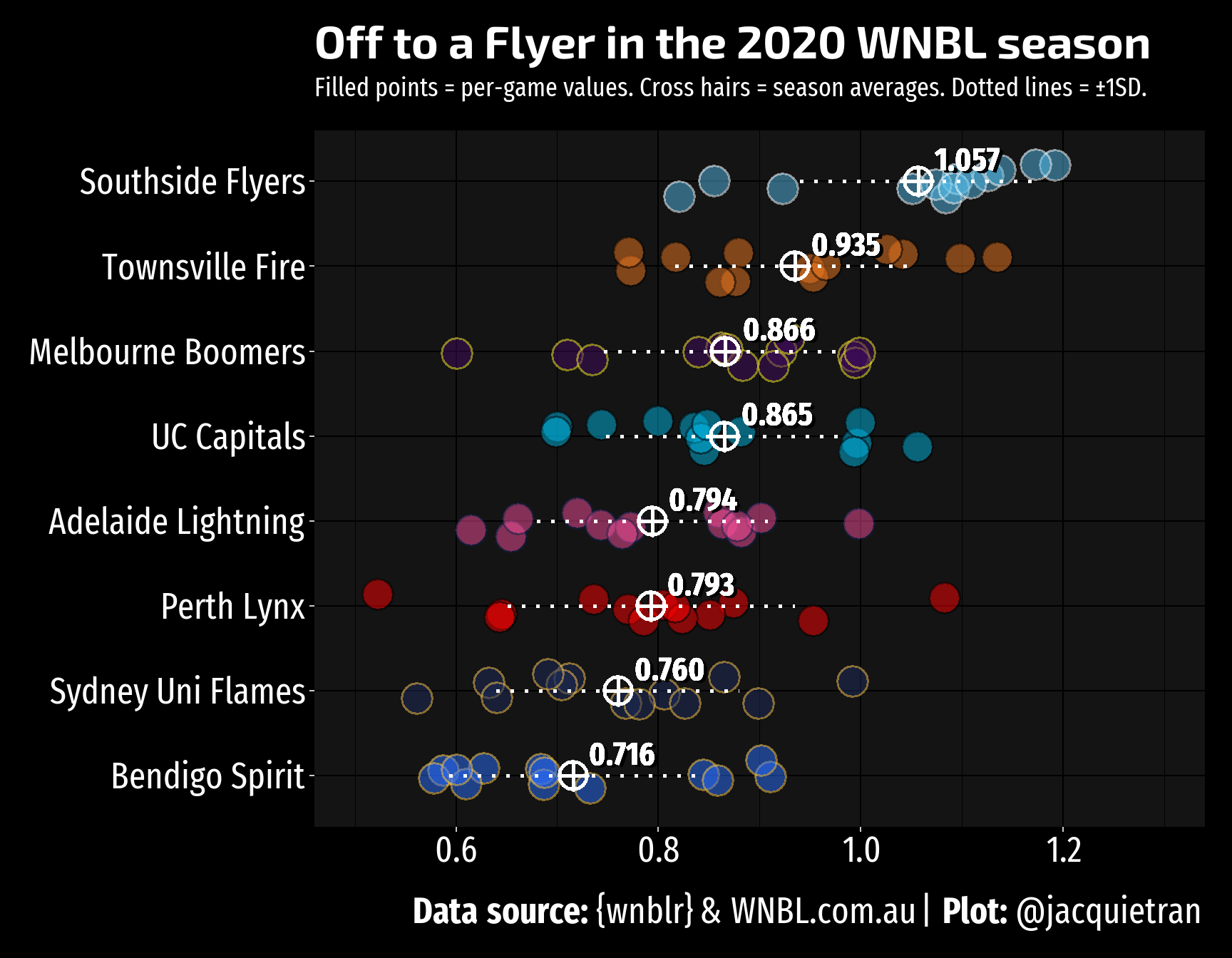
We get more of the story when we combine per-game numbers and season averages for each team. A few things that I noticed from plotting points per possession:
- Southside’s worst was not that bad: Southside’s worst record was 0.821 points per possession, in a loss to the Melbourne Boomers. This mark would still be good enough for 5th best in the league if ranked alongside team season averages.
- Which Perth Lynx will show up today? The summary stats table above shows that Perth had the largest standard deviation of all teams. By plotting per-game stats, the spread of their points-per-possession performances becomes clear.
- Their worst per-game performance was the worst of all teams in the 2020 season (even poorer than the worst showing from Bendigo, the wooden-spooners).
- Their best performance was 1.083 points per possession in a win against Bendigo.
- Maximising reward for effort: The top 4 teams on average points per possession were—as you may have guessed—also the top 4 teams on the ladder. In 2020, teams needed to be scoring at least 0.86 points per possession, on average, to qualify for finals.