(source: Wikimedia)
I shifted across the ditch early in 2018 to take up a role with High Performance Sport New Zealand. Remarkably, the one-year anniversary of our arrival here is right on the door step; I’ve learned so much in that time, particularly around qualitative methods and analyses. I enjoy the richness of insight that can be drawn from analysing text data, but a part of me does miss getting to work with numbers as much as I used to. And so, I decided I’d scratch the quant itch and get to know the fitzRoy R package by James Day.
In my stint at the Geelong Cats Football Club (AFL), I spent a lot of time retrieving, cleaning, merging, and wrangling data sets. An eyeball estimate of my personal time tracking data suggests I spent 70-80% of my ‘analytics time’ doing data preparation in those years. Yikes.

Much to my dismay, the fitzRoy package was first published to Github in January 2018, mere days after I finished up at Geelong FC. No doubt it would have been a massive time-saver for me if it had existed earlier!
Being both curious and a masochist (a great combination, I highly recommend it), I decided it was about time I checked out what fitzRoy can do so I could grasp the reality of my potential time-savings had this package existed when footy analytics was part of my job. Onwards…
Installing the fitzRoy package
fitzRoy is not on listed on CRAN yet, so you’ll need to install it with the help of the devtools package. To install both packages:
install.packages("devtools")
devtools::install_github("jimmyday12/fitzRoy")
Once the fitzRoy package has been installed, we can load it into our R session, along with other packages that will be used in this code-through.
library(fitzRoy)
library(dplyr)
library(knitr)
library(kableExtra)
library(ggplot2)
library(scales)
Exploring the data
Let’s take a look at AFL match data that has been catalogued on the invaluable AFL Tables website. For this code-through, we’ll focus on matches played over the last 20 years.
# Retrieve the data from AFL Tables
afl_data_1998_2018 <- get_afltables_stats(
    start_date = "1998-01-01", end_date = "2018-11-25")

# See variables in the data set
names(afl_data_1998_2018)
## [1] "Season" "Round"
## [3] "Date" "Local.start.time"
## [5] "Venue" "Attendance"
## [7] "Home.team" "HQ1G"
## [9] "HQ1B" "HQ2G"
## [11] "HQ2B" "HQ3G"
## [13] "HQ3B" "HQ4G"
## [15] "HQ4B" "Home.score"
## [17] "Away.team" "AQ1G"
## [19] "AQ1B" "AQ2G"
## [21] "AQ2B" "AQ3G"
## [23] "AQ3B" "AQ4G"
## [25] "AQ4B" "Away.score"
## [27] "First.name" "Surname"
## [29] "ID" "Jumper.No."
## [31] "Playing.for" "Kicks"
## [33] "Marks" "Handballs"
## [35] "Goals" "Behinds"
## [37] "Hit.Outs" "Tackles"
## [39] "Rebounds" "Inside.50s"
## [41] "Clearances" "Clangers"
## [43] "Frees.For" "Frees.Against"
## [45] "Brownlow.Votes" "Contested.Possessions"
## [47] "Uncontested.Possessions" "Contested.Marks"
## [49] "Marks.Inside.50" "One.Percenters"
## [51] "Bounces" "Goal.Assists"
## [53] "Time.on.Ground.." "Substitute"
## [55] "Umpire.1" "Umpire.2"
## [57] "Umpire.3" "Umpire.4"
## [59] "group_id"Heaps to dig into here! For the purposes of this quick exploration, I’m going to focus on learning more from the attendance data.
Data preparation
Before we get stuck into analysis, a little bit of data cleaning and wrangling is required. Firstly, let’s create a data subset that focuses on attendance and other variables that might be useful to consider alongside attendance figures.
# Subset the data
attendance_data <- afl_data_1998_2018 %>%
    select(Season, Round, Date, Local.start.time, Venue,
                 Attendance, Home.team, Away.team)
We also want the data organised so that one row = one match. To do this requires that each match is given a unique identifier.
# Create unique match IDs
attendance_data <- attendance_data %>%
    mutate(match_id =
                    paste(Date, Home.team, Away.team, sep = "-"))

# Identify duplicate instances of the same match ID
attendance_data$dup <- duplicated(attendance_data$match_id)

# Organise the data so that one row = one match
attendance_data <- attendance_data %>%
    filter(dup == FALSE) %>%
    select(-dup)

# Check the first few rows to see
# what the data looks like now
head(attendance_data) %>%
    kable("html") %>%
kable_styling()| Season | Round | Date | Local.start.time | Venue | Attendance | Home.team | Away.team | match_id |
|---|---|---|---|---|---|---|---|---|
| 1998 | 1 | 1998-03-28 | 1410 | Princes Park | 20957 | Carlton | Adelaide | 1998-03-28-Carlton-Adelaide |
| 1998 | 2 | 1998-04-05 | 1410 | Football Park | 40602 | Adelaide | Fremantle | 1998-04-05-Adelaide-Fremantle |
| 1998 | 3 | 1998-04-12 | 1410 | Waverley Park | 20532 | St Kilda | Adelaide | 1998-04-12-St Kilda-Adelaide |
| 1998 | 4 | 1998-04-19 | 1410 | Football Park | 41476 | Port Adelaide | Adelaide | 1998-04-19-Port Adelaide-Adelaide |
| 1998 | 5 | 1998-04-26 | 1520 | Football Park | 39974 | Adelaide | Geelong | 1998-04-26-Adelaide-Geelong |
| 1998 | 6 | 1998-05-03 | 1410 | M.C.G. | 23041 | North Melbourne | Adelaide | 1998-05-03-North Melbourne-Adelaide |
Lastly, we want to distinguish regular season matches from finals, since attendance at finals matches is typically higher. We can do this by creating a new grouping variable that can be used to separate these competition phases during the analysis.
# Standardise the naming of finals rounds
attendance_data$Round <- recode(
    attendance_data$Round,
    QF = "Qualifying Final",
    EF = "Elimination Final",
    SF = "Semi Final",
    PF = "Preliminary Final",
    GF = "Grand Final",
    .default = attendance_data$Round)

# Create new variable for competition phase
attendance_data <- attendance_data %>%
    mutate(phase = case_when(
        Round == "Qualifying Final"          ~ "Finals",
        Round == "Elimination Final"         ~ "Finals",
        Round == "Semi Final"                ~ "Finals",
        Round == "Preliminary Final"         ~ "Finals",
        Round == "Grand Final"               ~ "Finals",
        TRUE                                 ~ "Regular season"
    ))
Match attendances over time
How have attendance figures changed from year to year? Let’s take a look at regular season matches first. We can investigate this visually. One approach is to plot one data point for the attendance at every match in every season^. This will produce a lot of dots (4,051 dots to be precise!), so we can also use a box plot to get a sense of central tendency within any given season.
^ I like to plot every data point available, at least in the exploratory phase of analysis, to get a sense for all of the data. If we only plot summary data (e.g., the box plots only - medians and interquartile ranges, totals per season, means with standard deviations), then we miss out on seeing the spread of the data.
# Subset to regular season matches only
attendance_regular_season <- attendance_data %>%
    filter(phase == "Regular season")

# Create a list to store common theme options for use across plots
plotFeatures <- theme(
    plot.title = element_text(size = 16),
    plot.subtitle = element_text(size = 14),
  axis.text.x = element_text(size = 11),
    axis.title = element_text(size = 16),
    axis.text.y = element_text(size = 11),
    legend.position = "none")

# Build the plot
p <- ggplot(attendance_regular_season,
                        aes(x = Season, y = Attendance, group = Season))
p <- p + geom_boxplot(outlier.shape = NA, coef = 0)
p <- p + geom_point(alpha = 0.1, size = 3, colour = "#0072B2")
p <- p + scale_x_continuous(
    breaks = seq(1998, 2018, by = 2))
p <- p + scale_y_continuous(
      label = unit_format(unit = "k", scale = 1e-3),
      limits = c(0, 95000),
    breaks = seq(0, 90000, by = 10000))
p <- p + labs(
    title = "Attendance at Australian Football League matches",
    subtitle = "Regular season matches only, from 1998 to 2018",
    x = "Season",
    y = "# in attendance")
p <- p + plotFeatures
plot_attendance_regular_season <- p

# Display the plot
plot_attendance_regular_season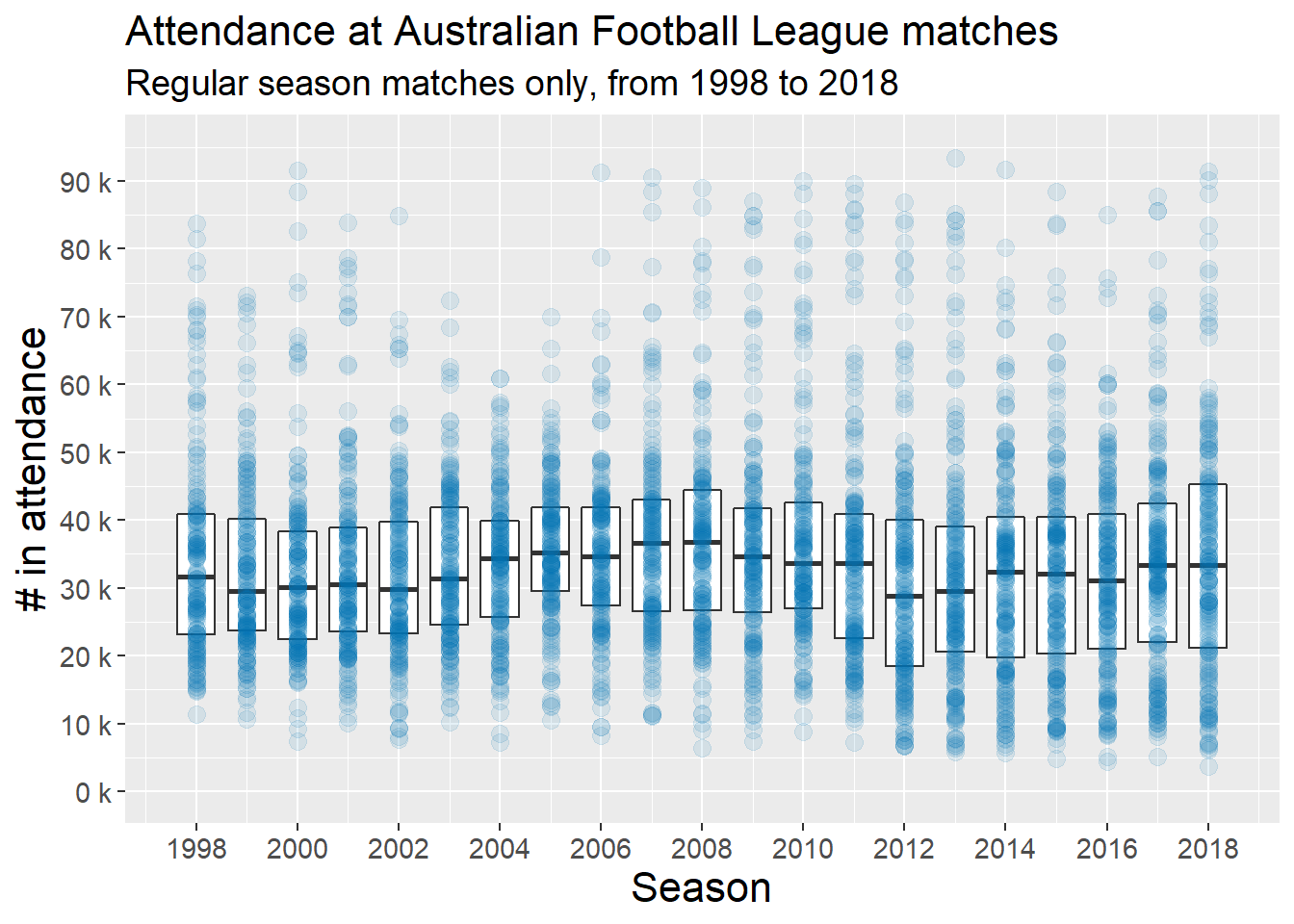
A couple things that stood out to me on initial inspection of this plot:
- 1999, 2003, 2004, and 2005 are notable for lacking extreme outliers as seen in all other seasons. The largest regular season crowd in these four seasons is under 75,000 (in 1999).
- The yearly median of regular season attendance has undulated over the last 20 years.
Ok, so what about attendance at finals matches? Let’s take a look:
# Subset to finals matches only
attendance_finals <- attendance_data %>%
    filter(phase == "Finals")

# Build the plot
p <- ggplot(attendance_finals,
                        aes(x = Season, y = Attendance, group = Season))
p <- p + geom_boxplot(outlier.shape = NA, coef = 0)
p <- p + geom_point(alpha = 0.5, size = 3, colour = "#D55E00")
p <- p + scale_x_continuous(
    breaks = seq(1998, 2018, by = 2))
p <- p + scale_y_continuous(
      label = unit_format(unit = "k", scale = 1e-3),
      limits = c(0, 105000),
    breaks = seq(0, 100000, by = 10000))
p <- p + labs(
    title = "Attendance at Australian Football League matches",
    subtitle = "Finals matches only, from 1998 to 2018",
    x = "Season",
    y = "# in attendance")
p <- p + plotFeatures
plot_attendance_finals <- p

# Display the plot
plot_attendance_finals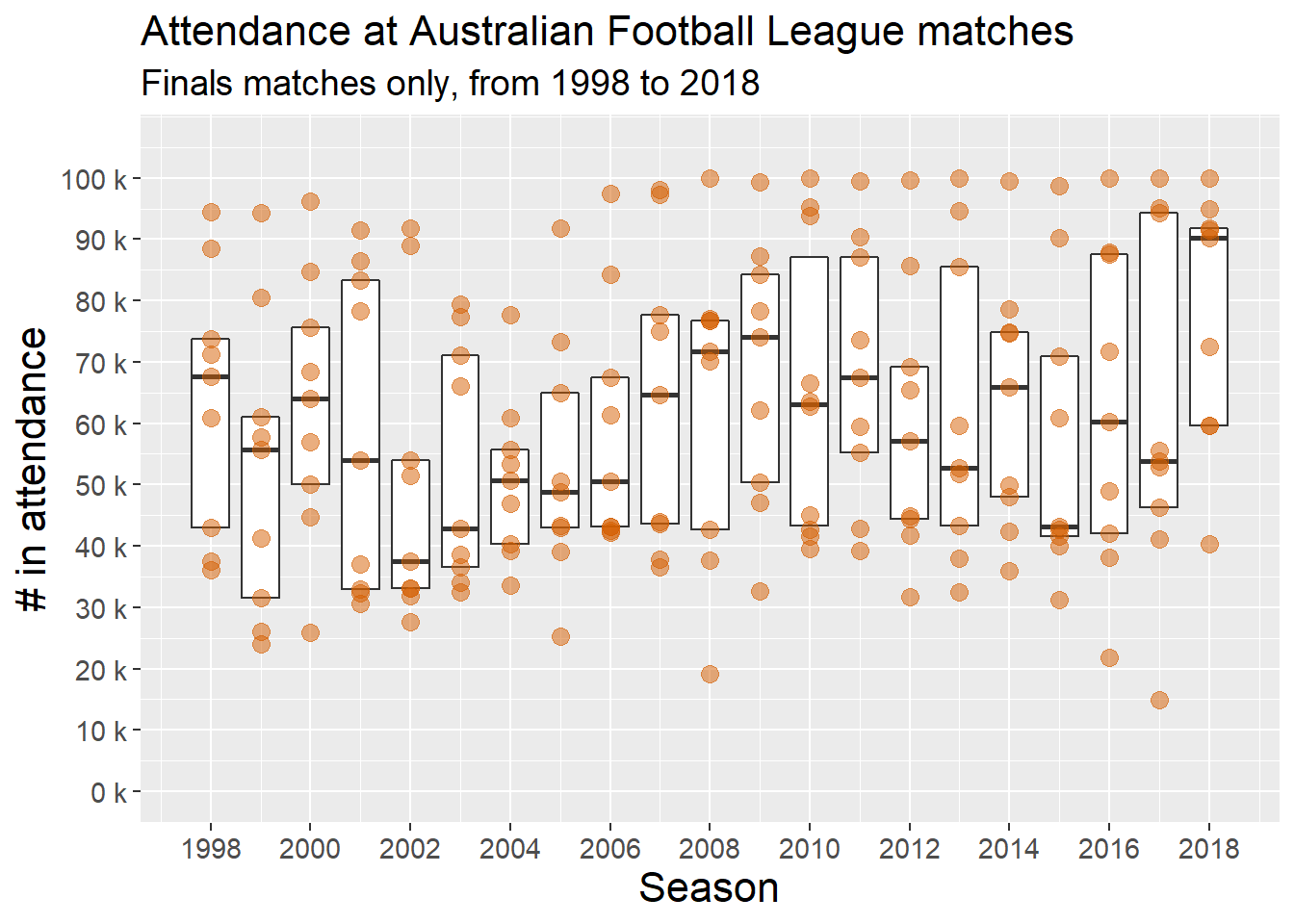
With there being only a handful of finals matches in any given season, the year-to-year variation in median attendances is unsurprising, as is the within-season variation (as shown by the heights of the boxes, denoting interquartile ranges).
Crowd size ‘exposure’ by team
Anyone who follows the AFL competition could quickly surmise that some teams (like Collingwood, Hawthorn, Essendon) would more often play in front of large crowds, compared to other teams (like North Melbourne, the Gold Coast Suns). With this data set, we can quantify how much teams differ from each other in terms of the crowd sizes they play in front of.
For the histograms below, I’ve used bins of 2,500. Let’s take a look at crowd sizes when teams play at home:
# Build the plot
p <- ggplot(attendance_regular_season,
                        aes(x = Attendance, fill = Home.team))
p <- p + facet_wrap(~Home.team)
p <- p + geom_histogram(binwidth = 2500)
p <- p + plotFeatures
p <- p + scale_x_continuous(
      label = unit_format(unit = "k", scale = 1e-3),
    breaks = seq(0, 100000, by = 20000))
p <- p + labs(
    title = "Distribution of crowd sizes when playing at HOME",
    subtitle = "Regular season matches only, from 1998 to 2018",
    x = "# in attendance",
    y = "Count of games played per bin")
p <- p + plotFeatures
p <- p + theme(strip.text = element_text(size = 10))
plot_attendance_home <- p

# Display the plot
plot_attendance_home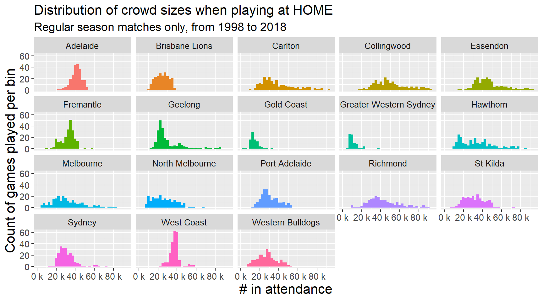
Similarly, we can look at crowd sizes when teams play away:
# Build the plot
p <- ggplot(attendance_regular_season,
                        aes(x = Attendance, fill = Away.team))
p <- p + facet_wrap(~Away.team)
p <- p + geom_histogram(binwidth = 2500)
p <- p + plotFeatures
p <- p + scale_x_continuous(
      label = unit_format(unit = "k", scale = 1e-3),
    breaks = seq(0, 100000, by = 20000))
p <- p + labs(
    title = "Distribution of crowd sizes when playing AWAY",
    subtitle = "Regular season matches only, from 1998 to 2018",
    x = "# in attendance",
    y = "Count of games played per bin")
p <- p + plotFeatures
p <- p + theme(strip.text = element_text(size = 10))
plot_attendance_away <- p

# Display the plot
plot_attendance_away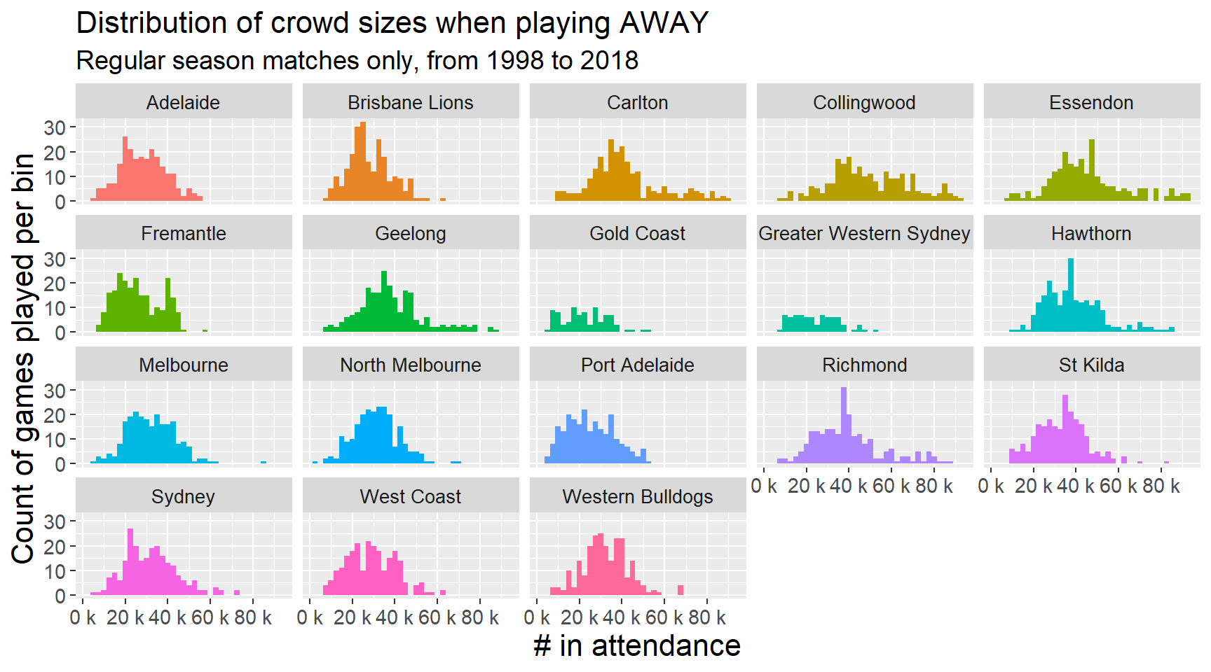
Although I don’t work in footy now, I do feel a sense of calm that, through packages like fitzRoy, others may be saved from some of the time-consuming, headache-inducing frustrations that can come with manually scraping, cleaning, and merging data sets across disparate sources…